
Intrigued by the unusual album designs he has produced for Tame Impala, and the way in which he captured and reproduced a visual outlet for the music.
I thought it would be interesting to look into his other work for other artists.


Most of Beatty's work is rather eccentric, rich in colour and bold beyond belief. These are the properties I admire within his album designs. They really explore the music that comes from these visuals and expresses them appropriately.
He explores lots of textures and seems to contrast them with clean
bold typography. Each of the elements within his designs do not take anything away from each other - they appear balances and well thought out.

Beatty also does tour/gig posters for a
artists. This particular one for IDIOT GLEE
uses a simple three colour scheme and simple
typography experiments in a
postmodernist design.


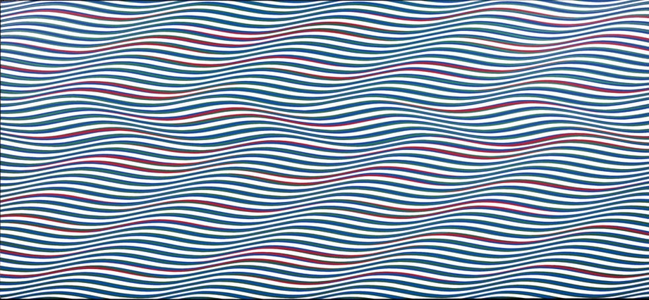
BRIDGET RILEY
%2069.jpg)
Bridget Riley is well-known since the mid-1960s for her distinctive, optically vibrant paintings, called “Op Art”.
I've been a fan of Riley's work for the past few years - since I saw her work displayed in a London gallery (can't remember the name - only remember because I bought a postcard with Riley's work on) in 2014.

I've since seen her work at Whitworth Gallery in Manchester (2015).
Creating Tame Impala designs, looking at Riley's work is something that will definitely inspire me - especially as they give off a similar vibe.
No comments:
Post a Comment