A wayfinding system for Deakin University
by Simen Strom Braaten

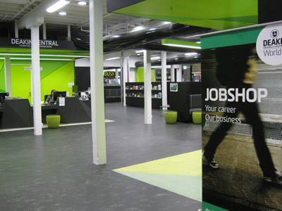

This Deakin University way finding system for its library, offers a modern, fresh approach. Using an approximate number of four selected colours. Although the shades/tones of the colours differ within the design of the buildings interior they stick to a similar pallet.
The navigation system uses these colours, which shows consistency. A map of the different floors is displayed outside a door to a stairwell to provide information about the platform of the each individual floors. Using a simple graphic white map laid onto a black background gives instant impact to the eye, making it very clear for a reader. The map uses pictograms to represent various locations e.g. man/woman figure for toilets. A large green number '3' is positioned to the bottom left of the map, and proceeding to the left the level number is repeated. Interestingly, a key to explain the pictograms on the map are provided. Something I may want to avoid during my designs, as I believe a pictogram should be self explanatory and extremely clear.
Typography layers one of the walls, acting as a sign for a potential office of service. The typography is simple and very clear from the contrast between the black and white.
The layout and choice of colours used throughout the design of the interior and way finding are successful. However, these work well in a compacted space. In a large open space like a train station it might come across as busy, stressful and unnecessary. A choice of three colours would be more appropriate and less intense - especially light neutral colours.

(estimated colours)
Stadtwerk Lehen - signage system
by Hans Renzler


I find this design really interesting. Creating a simplistic/minimalistic 2D design and applying it to a 3D object is very effective. It displays the idea that a simple design can easily be transferred onto many various objects and different materials, and still be dynamic.
The grey stone block acts as the background for the type, shapes and map displayed.
Contrasting colours were carefully chosen for this design so they can be easily defined against the grey.
White has been chosen for the top half of the grey stone block, which is noticeably darker than the bottom half. This is a well thought design decision as it results better visibility for the white outlined map. The lighter bottom half uses black and a pale yellow in its type, which stands out strongly against the background, whilst contrasting with each other.

(estimated colours)
Storyline Studios
by Work In Progress

This form of wayfinding is rather unusual and unique. Instead of using arrows, symbols, pictograms and maps, on the white plaques they simply state using typography what is expected on that certain floor or through the door. On the other side of the door there might be arrows, symbols, pictograms and maps explaining the locations of each plaque, although by providing summary of what is to be expected it is technically still a technique of wayfinding. By giving simplistic information it reassuring to people that they are in fact going in the correct direction and on the right floor.

No comments:
Post a Comment