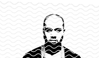
After searching through various photoshoots of Kanye, I found this to be the most powerful and serious. Which is what I want to represent on my banknote.
Knowing I cannot print digitally, printing a photograph manually became a challenge. I decided to explore the root of half-tone, which is where images are split into CKYM. However, when black and white the colours plot of into black - grey - white tones.
Although this is a popular way of screen printing photographs, I was not sure I wanted the bank note to be represented by something that performs like a photo. Also, screen printing can be unpredictable at times and with some of the circles being grey they might not expose enough to be captured in the final screen.
I went forward and just edited his head within a oval, similar to how figures on the US dollars are. It gives them a sense of importance.
Trying something different, I decided to threshold the image instead. This was a much bolder image. The dark areas really create a dauntless vibe that channels the seriousness I want to achieve.
I did not like the fact parts of the image were to grainy, so I filled in areas to prevent it from looking messy. Also, by doing this the screen will have a crisper edge.
Here I experimented with wavy textured lines, some close together and another further apart. I noticed when analyising the 100 US dollar the figures are drawn out and created using thin lines. I thought I would recreate this aesthetic to see if it would fit. I find the lines rather distracting and they take away from the image, especially the bottom one as it is completely overtakes the original image.
To represent Kayne as a leader, I wanted to incorporate his family and their persona. Him and Kim Kardashian have two children together North West and Saint West. Instantly I recognised their initials as being part of a compass and with North and West being part of the symbol, it relates to both the children. A president's family are always at the centre of attention during their number of years within the government. Seeing as how Kanye's family are already in the limelight, having hundreds of news articles written about them each day I thought it was relevant to include within the design.
Using a compass design I found off google I used Adobe Illustrator to draw over and create my own. I later added North, West and South (leaving out East) and connected the initials to create the ones of his children.
To represent his Kim Kardashian, I took one of her logos, mostly used for her fragrances collections. The logo is elegant and rather plush, which feels cohesive with the other symbols and images.
Kanye's career began in music and is still very much about music. He claims himself to be 'God' at times (he even has a song titled 'I am God') and thinks of himself as a 'genius'. To represent this rather confident self examination Kanye has of himself, I thought why not better incorporate a CD disc in the centre of his forehead. By doing it represents music as almost a religion or a way of expressing his thoughts with his lyrics - all curated within the mind.
To take this concept further I added in the reflection cd's can often make when exposed to a light source. This makes it more obvious and prominent.
Kanye's music is a global entity that reaches many ears. Also visually putting the world on his head could be seen as knowledgable or aware. I decided to show the USA clearly on the map to represent the country he represents.
Here I experimented with various typefaces to explore the possibilities of including serif and sans serif type onto the banknote. I opted for the serif font Baskerville Semibold (16pt) for the small text that reads "Federale Reserve Note". Instead if overwhelming the design with type, much like the US dollar does, I wanted it to be much more minimal. Still keeping parts small and others large contrast well and still give that vibe of a banknote design.
After drawing out some ideas of how I can design the Y, which stands for Yeezys, the new currency in Kanye's vision of the USA. Yeezy is a common nick name for Kanye and he often uses it within his music and fashion brand.
I transformed some of the drawings into a digital format. I decided to choose the thicker, smaller, boldest one, all the stroked of the letter are thick which makes them the most distinctive out of them all, I also did not want them to contrast with the '100 YEEZYS' type next to the money symbol.
The '100 YEEZYS' was typed in Superclaredon Bold.


No comments:
Post a Comment