Friday, 29 April 2016

Studio Brief 04 - Reflective Practice

Studio Brief


  • Produce a printed media that related to first years, whether socially or academically.


Background/Considerations


  • Facilities of the university 
  • Target audience - freshers


Mandatory Requirements

  • Final resolution (printed)
  • Cheap stock so it can be produced many times
Deliverables 
  • Support work
  • Resolution to the brief in design method appropriate 
Initial Ideas


  • Produce a double sided postcard expressing names of Galleries and Museums.
  • Uni social life - where are the best places to visit? drink? eat?
Final Concept

Produce a double sided postcard expressing names of Galleries and Museums for first years to check out throughout their academic year. If I was to be a first year now, I would find this rather helpful. I personally did not attend as many exhibitions as I would have liked this academic year and I think having a small guide would have been helpful to checking out new exhibitions and galleries, where inspiration for work can be taken from.

I began by researching into local galleries and art museums.

I struggled to find individual exhibitions that would be so far ahead for the first years, going into 
2016 - 2017 was rather difficult. Usually exhibitions are advertised only weeks or months before, making it rather impossible to showcase them.

Instead I decided to create a post card (or potentially business card size) where I would give information about established galleries and museums.

However, these are quite standard and I still want to be able to provide students with fresh new art shows and exhibitions, and create a system where it makes them feel a part of something. To solve this I could link a website onto the card, where a blog or page would be dedicated to giving information about the new exhibitions. This keeps it fresh and appealing to students, whilst still giving the names of the galleries, which will still be helpful to new students who do not know the area.

I wanted the design of the be simple, contemporary and small enough to fit in a pocket or wallet.

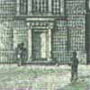
I was influenced by an art exhibition in 2013 that took place in Leeds, titled the Northern Art Prize. By including a part of an exhibition that took place in Leeds means something and demonstrates how exhibitions and events can really inspire a person and influence their work.


Wednesday, 27 April 2016

Studio Brief 03 - Collaborative Practice

As a group we decided to incorporate the coin into our designs as much as we could, to create a contrast between the banknote gallery pieces we would be displaying.


We all decided our roles within the group and mine was to come up with a logo. I experimented using multiple lines to form the letter M which I thought was the most prominent word in the title of the exhibition.


Here I applied the gold, bronze and silver filters that we would be working with and as a group we designed the bottom left logo's together, infusing aspects of the British banknote with a copper layer.
We decided either screen printing or foiling could be the process to follow up on.
As a group there was only three of us who turned up to the initial two meetings, including me. This made it rather difficult to stay on task when half the group was missing. At times as a group we were disjointed and constantly unsure which direction to take the branding into. We communicated over social media on a group chat throughout the process, but it probably would have been more useful to meet up in person more. Although, I believe we came up with a good concept and demonstrated it through digital mock ups, we could have taken it further and amplified our branding as a whole, by making physical mock ups and pushing ourselves as a group. However, I have gained a lot of experience doing group work that I will take on board when working in a group again.


Tuesday, 19 April 2016

Studio Brief 02 - Licence to Print Money - Evaluation


From this brief I have gained experience and been able to appreciate the concept of not using digital print. It has allowed me to fully explore the process of screen printing and has opened my eyes up to other possibilities of print.

My banknote was based around the concept of Kanye West following up his decision to run for president in 2020, of the United States if America. This whole bizarre story inspired me to create a banknote with the vision on Kanye in mind, bringing is unapologetic attitude, design aesthetics and personal attributes to light. Being able to enter someone else's mind set and creating something you imagine another to do is an interesting design process I have throughly enjoyed.

The process of screen print was at time tedious and it came with some challenges, such as, not considering the fact I would have to line up each print up correctly for the second print to successfully match my design. Before the exhibition, reprinting the banknote is something I am going to do as I would like the design to be as precise as possible.

Another factor I should have considered during the design process is the size of the type I used in some aspects. They are rather difficult to read have not printed out like I envisioned them to. Although many banknotes have lots of microscopic lettering in their designs, they use printers with much more power and accuracy than screen printing can achieve. I overlooked this and now understand my design decision could have been more thought out.


Monday, 18 April 2016

Studio Brief 02 - Licence to Print Money - Screen print process


Set the exposure to 330, this should be the right setting that will expose the amount of image


Initially I printed out each note individually and then quickly realised it will be extremely time consuming when they are not equally in line.


I decided to print three designs out on two pages so when I print each time three will be created and once in line with each other it will be more accurate as the positioning of the gold layer will have to be precise.


Blank ink first prints drying out. Some have come out rather successful, whilst others have slightly faded edges and aspects. I printed out 5 A3 sheets meaning I have 15 banknotes to work with.


After selecting a gold pigment for my gold layering. I had to mix my pot within a airing cupboard due to the gold going everywhere.


Layering on the gold ink.

One mistake I made during this process was the fact that not all the black ink prints where lined up the same, meaning after I printed my first gold layer accurately, it became difficult t see through the screen to line up the next set. In hindsight I should have taped down each note down before I printed the first meaning with each print I would just remove the top layer to reveal the next - meaning they would all be in line. Due to not doing this a lot of my prints where unsuccessful. As it took time to line up the prints as the ink began to dry on the board and it become difficult get the ink to transfer onto the paper, something even flooding it too much.


Here are some examples of unsuccessful prints.


On a few prints even the black ink was not 100% successful and the alignment of the gold layer was off on some.


Sunday, 17 April 2016

Studio Brief 02 - Licence to Print Money - Final design

Size -

Process - throughout designing this banknote I had in mine I would most likely screen print, using two layers to achieve a white, black and gold/metallic colour palette.

For the final design I edited in the gold parts using Adobe Photoshop where I envision them to be when screen printing.


Here is the design I will use to expose with the black ink with. Later on I will print the gold ink on top of the this.

Gold ink screen.

Saturday, 16 April 2016

Studio Brief 02 - Licence to Print Money - Banknote development


After searching through various photoshoots of Kanye, I found this to be the most powerful and serious. Which is what I want to represent on my banknote.


Knowing I cannot print digitally, printing a photograph manually became a challenge. I decided to explore the root of half-tone, which is where images are split into CKYM. However, when black and white the colours plot of into black - grey - white tones. 

Although this is a popular way of screen printing photographs, I was not sure I wanted the bank note to be represented by something that performs like a photo. Also, screen printing can be unpredictable at times and with some of the circles being grey they might not expose enough to be captured in the final screen.


I went forward and just edited his head within a oval, similar to how figures on the US dollars are. It gives them a sense of importance.


Trying something different, I decided to threshold the image instead. This was a much bolder image. The dark areas really create a dauntless vibe that channels the seriousness I want to achieve.


I did not like the fact parts of the image were to grainy, so I filled in areas to prevent it from looking messy. Also, by doing this the screen will have a crisper edge.


Here I experimented with wavy textured lines, some close together and another further apart. I noticed when analyising the 100 US dollar the figures are drawn out and created using thin lines. I thought I would recreate this aesthetic to see if it would fit. I find the lines rather distracting and they take away from the image, especially the bottom one as it is completely overtakes the original image.


To represent Kayne as a leader, I wanted to incorporate his family and their persona. Him and Kim Kardashian have two children together North West and Saint West. Instantly I recognised their initials as being part of a compass and with North and West being part of the symbol, it relates to both the children. A president's family are always at the centre of attention during their number of years within the government. Seeing as how Kanye's family are already in the limelight, having hundreds of news articles written about them each day I thought it was relevant to include within the design.
Using a compass design I found off google I used Adobe Illustrator to draw over and create my own. I later added North, West and South (leaving out East) and connected the initials to create the ones of his children.
To represent his Kim Kardashian, I took one of her logos, mostly used for her fragrances collections. The logo is elegant and rather plush, which feels cohesive with the other symbols and images.


Kanye's career began in music and is still very much about music. He claims himself to be 'God' at times (he even has a song titled 'I am God') and thinks of himself as a 'genius'. To represent this rather confident self examination  Kanye has of himself, I thought why not better incorporate a CD disc in the centre of his forehead. By doing it represents music as almost a religion or a way of expressing his thoughts with his lyrics - all curated within the mind.


To take this concept further I added in the reflection cd's can often make when exposed to a light source. This makes it more obvious and prominent.


Kanye's music is a global entity that reaches many ears. Also visually putting the world on his head could be seen as knowledgable or aware. I decided to show the USA clearly on the map to represent the country he represents.


Here I experimented with various typefaces to explore the possibilities of including serif and sans serif type onto the banknote. I opted for the serif font Baskerville Semibold (16pt) for the small text that reads "Federale Reserve Note". Instead if overwhelming the design with type, much like the US dollar does, I wanted it to be much more minimal. Still keeping parts small and others large contrast well and still give that vibe of a banknote design.


After drawing out some ideas of how I can design the Y, which stands for Yeezys, the new currency in Kanye's vision of the USA. Yeezy is a common nick name for Kanye and he often uses it within his music and fashion brand.

I transformed some of the drawings into a digital format. I decided to choose the thicker, smaller, boldest one, all the stroked of the letter are thick which makes them the most distinctive out of them all, I also did not want them to contrast with the '100 YEEZYS' type next to the money symbol.
The '100 YEEZYS' was typed in Superclaredon Bold.


Friday, 15 April 2016

Studio Brief 02 - Licence to Print Money - The US dollar


Here are some features that make the banknote so distinctive. Each acting as a security precaution.


Banknote number is always unique. In the latest serie of the US dollars the number is more complicated; it goes as AA 00000000 A plus reserve bank letter and digit.


Much of the ornamental decoration on the US dollars is done in negative, both on obverse and reverse. On the obverse it's also done with intaglio printing.


Thin lines in the numerals also make it more difficult to counterfeit the banknote. Gradient thickness of the lines is also a feature against fraud.


Miniature details are the most important feature about the US dollars. Portraits become more complicated from serie to serie, ans a lot of tiny details are present at the picture on the reverses of the notes. Portraites are done with intaglio printing.

My Design

Using such detail may be difficult as the brief restricts us using print methods only that are not digital.
Screen print can capture a decent amount of detail, but thin small lines and tiny drawings may not successfully print out. If I am to achieve a successful print I would rather use a bold crisp design that can 100% not be effected by the print method.