Selfish by Kim Kardashian
Kim Kardashian West is a reality television personality, actress, business woman, socialite and model. Like most of the world, I find her and her family really interesting and follow their every step on social media. I'm no super fan, but when I found out Kim was releasing her own book - dubbed to be filled with photographs of her journey through life so far - I was compelled to find out how the content would be managed and laid out.

Interestingly enough, I found the book to be rather tasteful and engaging. Yes it is filled with Kim Kardashian selfies and vain shots of her 'glamourous' life - and I understand it is not everyone is going to be rushing out to buy it. In fact, it has only sold 32,000 copies in it's first 3 months of being on the shelf.

The colour palettes used within the photographs really express Kim's recent aesthetic. They represent her fashion style and mood she often excels visually through her Instagram account.
(instagram.com/kimkardsashianwest)

Here is a simple block grid of how some of the photos are laid out like in the book. Each photograph keeps within the boarders throughout. They are simply organised - which is really effective. The white space around the photos helps draw more attention to them and they contrast well against the colours within the photos themselves.

Typography is very minimal.
Each page is numbered (positioned horizontally in the margins) and sometimes captions are given under particular photos.
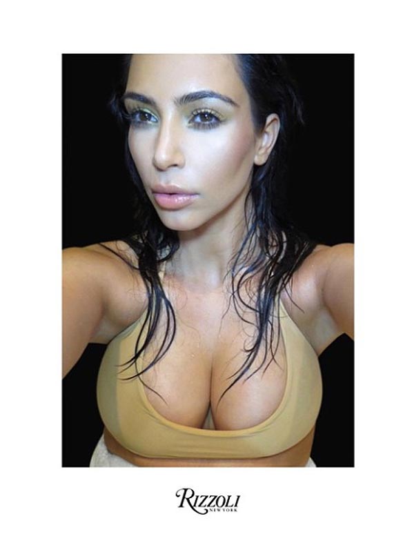
The title of the book is actually not printed on the front cover, instead the publishing company have branded their logo. This is an unusual design decision. A publishing company's brand logo is mostly on the back cover, however, designs vary.

Layout is really important. Keeping it simple and letting the content speak for itself is something I want to explore with my own book design.
No comments:
Post a Comment