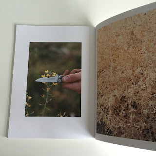
AT WATER, LOS ANGELES by Nathanael Turner
This particular book, is one of my favourite of all time. I admire it's simplicity - from the use of large margins and white space and it's imagery. The calming vibe colour palette used throughout really captured the contents and emphasises it.
I attempted to get in contact with the photographer/author himself via Instagram as I follow him and he recently liked and commented on my post about his book.
I took it upon myself to message him and ask a couple of questions. Hopefully I will receive a reply and have some insight on the works behind producing a photography book.
Edit: I have yet to receive a reply (18/04/16)
Contrasting colours (pink vs green)
Although in this case the colours are pastels so are subtle.
Parallel grid.
Full page paginated with empty page (used for impact)


No comments:
Post a Comment