First began by researching the plot of my chosen book, as I've never picked up an Agatha Christie book or really ever acknowledged their many designs.
Title : One, Two, Buckle My Shoe
Initially began by looking at past designs. The book was published in 1940 and interestingly the cover artist for the first edition is unknown. Since then there was been many publications of the same book, each time sporting a new cover design.
original design by unknown
other cover designs through the years
I knew from my time limit that I probably could not be able to achieve a design as detailed as some of these previous ones. Which is somewhat a restriction to my final outcome, as I wouldn't have the luxury to explore different design areas and create final designs for each to decide out of. Instead I simply began by sketching a few ideas and creating a mini mind map of potential ideas; the plan being to choose one and let it develop within it's own path.
Found this typeface called 'Catch and Release' whilst researching types. Simply began by typing into google 'Book types' which came up with various styles and fonts that all seemed very serious and rather bold.
Displayed the font out as the title, but decided it wasn't appropriate for the novel. It feels too bland and not enough mystery or seriousness I want to get across. Instead I decided to focus on the design and would come back to the typeface of the title when the design was done - means I could pick out a more appropriate type.
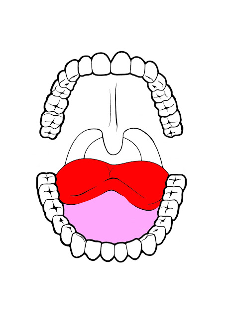
Inspired by the 1940's (when the novel was published), I researched old dental records and considered laying out the book design in the style of one. With the time scale being low, instead I decided to create an aspect of the old dental records - the teeth diagram.
Using my wacom tablet I drew out a cartoon like outline of the teeth, tongue and tonsils for the main design.
Began adding colour and experimenting with colour schemes.
Using my wacom I did a quick sketch of a buckle that I wanted to incorporate within the design. However, I spent most of my time drawing out the teeth structure so instead decided to just digital create a buckle using Adobe Photoshop.
Here it kind of struck me that the mouth/teeth drawing could act as a buckle itself, so I decided to incorporate the buckle design into the mouth to make a hybrid of the two. Whilst still keeping it obvious to what it is.
The murder weapon in the novel, being the gun, was another factor I wanted to include in the design. However, after drawing out an outline of a gun using my wacom tablet and incorporating it into the design, I felt it was rather odd and did not necessarily fit into the layout or aesthetic of the design.
To create a more eerier atmosphere of death I filled in the colours with a grey and light pink/grey colour palette to represent this vibe.


No comments:
Post a Comment