
On our day visit to Yorkshire Sculpture Park, I took as many photos I could of the sculptures I encountered on my way around the park. I mostly did this to grasp an identity for the park by documenting what is in it and inspire ideas for the re-brand.


Here are various variations of the YSP logo, that acts as a symbol and works with typography. I actually find the logo to be quite simple, bold and effective. However, it doesn't truly represent what the park's aesthetic or expresses any of it's beautiful and creative art work.
With the re-brand, this is something I want to focus on. From my designs I aim to create a symbol that showcases the park's vision, whilst still keeping it simple, yet effective. By doing this it will hopefully attract more visitors and become a more well known establishment.


One of the first sculptures I encountered was the Niki deSaint Phalle Buddha, created in 2000.
I was instantly drawn to the extravagant eye-catching colours and ceramic method used to make up each individual part of the Buddha.
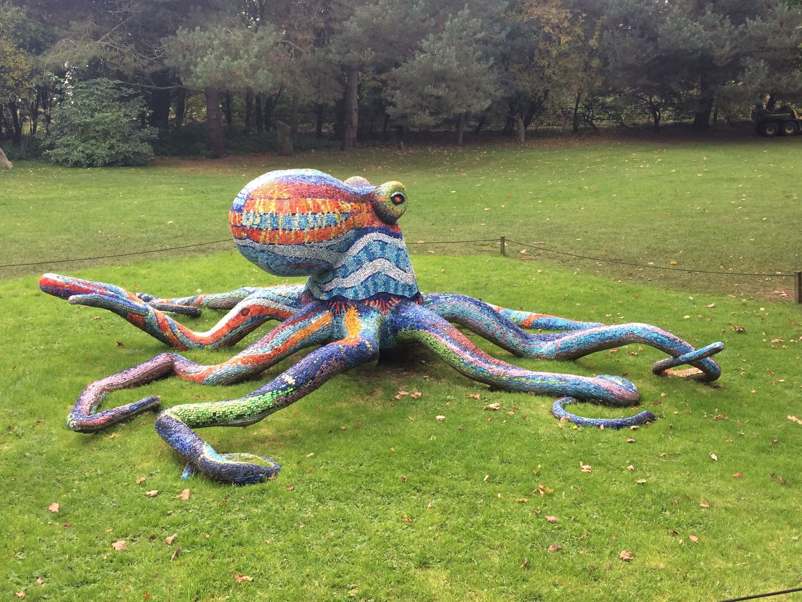
Marialuisa Tadei's Octopus, 2011


Marialuisa Tadei's Night and Day
Marialuisa Tadei's colourful scultures, Octopus and Night and Day, and Nicki deSaint Phalle's Buddha stand out amongst many others due to their work of nature; mosaic. The tiny pieces of different colour and material build up to create an almost pixelated technological contrasting effect against the greenery that surrounds them. They gave off a mystical dreamy vibe, especially in the sunlight when the glass ceramic pieces glistened.
From these sculptures, I was instantly inspired by their colour, materials and unique shapes they each create. The use of mosaic and they way in which they are never necessarily perfect gave me a design idea for a symbol for the park.

Avenir Black

Avenir Next Heavy

Gurmukhi MN Bold

Arial Rounded MT Bold Regular

Helvetica
Simply researched a few types of typefaces I could work with to create the symbol. Like the original YSP logo, for this particular design I wanted to keep a similar vibe with the use of Y, S and P being the main structure for the symbol.

From this I sketched out a few possible design ideas, experimenting with the layout, positioning, shape and form the three letters could stand as.


Using Adobe Photoshop and my Wacom graphics tablet I experimented with the Avenir Next Heavy, Arial Rounded, Gurmukhi and Helvetica typefaces in attempt to recreate some of those designs I did in my sketches and bring them into a digital platform.
They are quite rough and not well edited, but I only wanted to get a feel from them to see how they transferred from sketch designs.
Out of the various typefaces and designs I decided to continue with Helvetica. This is mostly due to the simplicity of the typeface and it's capability of being quite neutral. This links back to the idea that as a whole the sculpture park will be well represented by one symbol, yet contribute unique factors - given by the sculptures and their influence themselves.


One of the first things I picked out when I saw the Buhha was the complex colours that covered the whole thing in patchwork and it insanely reminded me of the CMYK colour model. They way the circles over lap onto each other and create the layers that filter through to create the other colours (red, green, blue and black) also made me think about the mosaic work and how they were imperfectly laid out and did the same thing - essentially.

Instead of having the letters separate, I wanted to incorporate each of the letters together to form a strong symbol.
result :

Black background to show yellow more clearly.


Trees by Dennis Oppenheim was another sculpture artist that caught my attention. I really identify with these pieces, mostly due to the fact they identify with the sculpture park itself.
Dog kennels, toilets, dustbins and pieces of fence are amongst a large number of items that take up this artificial landscape; a visitor to the museum is confronted with the concept of synthetic nature in an estate that stands out by itself in its rural surroundings.


From one of the photos I had taken of the sculpture, I edited out the background using Adobe Photoshop to leave a cut out version.

From the cut out I wanted to create a silhouette, just using black and white. This creates a lot of negative space within in the symbol and makes it appear distinct and interesting.

Here I inversed the colours so they were opposite. I think this helps make it stand out even further, especially with more of the black - creates more of a contrast in my opinion.
No comments:
Post a Comment