
Pop Boutique are an independent vintage and retro clothing store that are located in London, Manchester, Liverpool, Leeds and Goteborg (Sweden).
Founded in 1985 and it claims it's mission is to "Bringing back to life retro clothes from the 60's, 70's and 80's".
"Our employees all love vintage clothing and we try our best to keep the shops filled with cool vintage pieces that are not overpriced as well as our own label. All goods are ethicly sourced many being made from recycled fabrics."
"Pop Boutique has been open in London since 1996 its a relatively small store packed with great vintage clothing, accessories, furniture, vintage vinyl and kitch. It's close to London's Convent Garden Hotel so we get our fair share of celebs popping in as well as our regular vintage junkies."

Shop sign outside Manchester store

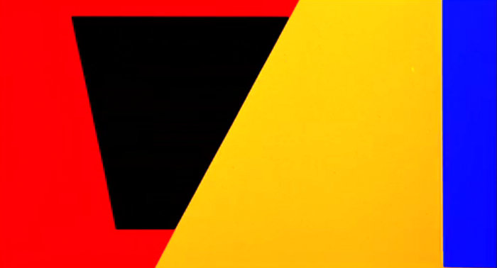
colour variation design of original logo

London store

Leeds logo and shop sign, photographed by myself.
Before given this brief, I have previously been to the Leeds, Manchester, Liverpool and London stores. I'm an avid shopper of Pop Boutique's for a few years now and I closely follow their social media networks, such as, their various Instagram accounts.


I documented my visit to the Leeds Pop Boutique by taking photographs as I went around and shopped myself. Did this to get a real feel for the shop, it's clothing/products and surroundings/aesthetic, even though I've already experienced it many times.
You really get the retro feel every time you enter one of their stores. From the mustard yellow stained wallpaper, to the funky red curtains, to the black and white patched tiles that make up the stairs that lead to this lounge like layout; such a throwback.
The 70's inspired interior instantly reminded me of it's icons and music figures.
"Music and fashion have had a kind of incestuous relationship since the Fifties. It started with people like Elvis Presley and pop icons like James Dean. Then it exploded in the MTV days. Now, with the Internet, it's instantaneous."
- John Varvatos


Inspired by the colours, photography, culture and music of the 70's I wanted to manipulate and experiment with some of the photos I had taken of the Pop Boutique in Leeds.


Using Adobe Photoshop I used a few types of filters, such as Radial Blur, to create this spiralling blurred effect that reminds of the shape and texture of records.

Out of the photos I then cut out circle shapes and straight lines to create the text that is POP.
Here is also when i made a conscious decision to use POP as the name of the logo.
Critical Feedback -


Crictical Feedback -
- "Colours on black. Instantly recognisable as a shopper. Colourful and vibrant."
- "Bright colours, suits the shop"
- "I think the first design would be the most versatile design to transfer to bags etc… because it is the most bold design and would stand out and be extremely effective at a range of sizes."
No comments:
Post a Comment