It was decided we would have weekly meetings or at least communicate over email/social media on a weekly basis to keep up with the work process and give each other feedback on the design of the publication.
The deadline for the project is May, however, we agreed finishing the design process earlier was necessary in order to get the publication printed in time.
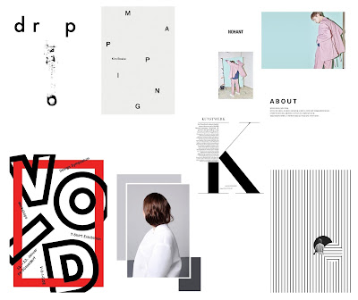
The design of the magazine was discussed within the meeting. Prior to the meeting visual research was undertaken as the brief states "champion modern, exciting and creative design with a heavy focus on photography to create an alternative view of a saturated market".
Colour scheme: Minimal, with perhaps a splash of colour against monochrome. It was mentioned perhaps a red would be used for parts of type and possibly imagery in relation to road signs.
Typefaces: A contextual typeface has been chosen by the client in relation to the theme of the publication.
These typefaces (http://www.cbrd.co.uk/fonts) are official British road signs and it has been suggested by the client to include them within parts of the design. Experimental layouts will use these types to see if they are successful.
The client also stated to not be restricted by these typefaces and to include various ones that would compliment a modern design. It was said in the meeting that bold fonts were of interest.
Here were a few initial layout designs that were curated based on the modern and non-commercial themes the client has asked for. It was agreed I experiment with the content he initially has and from there design layouts until we agree on a structure and aesthetic that best suits the magazine's intentions.


No comments:
Post a Comment