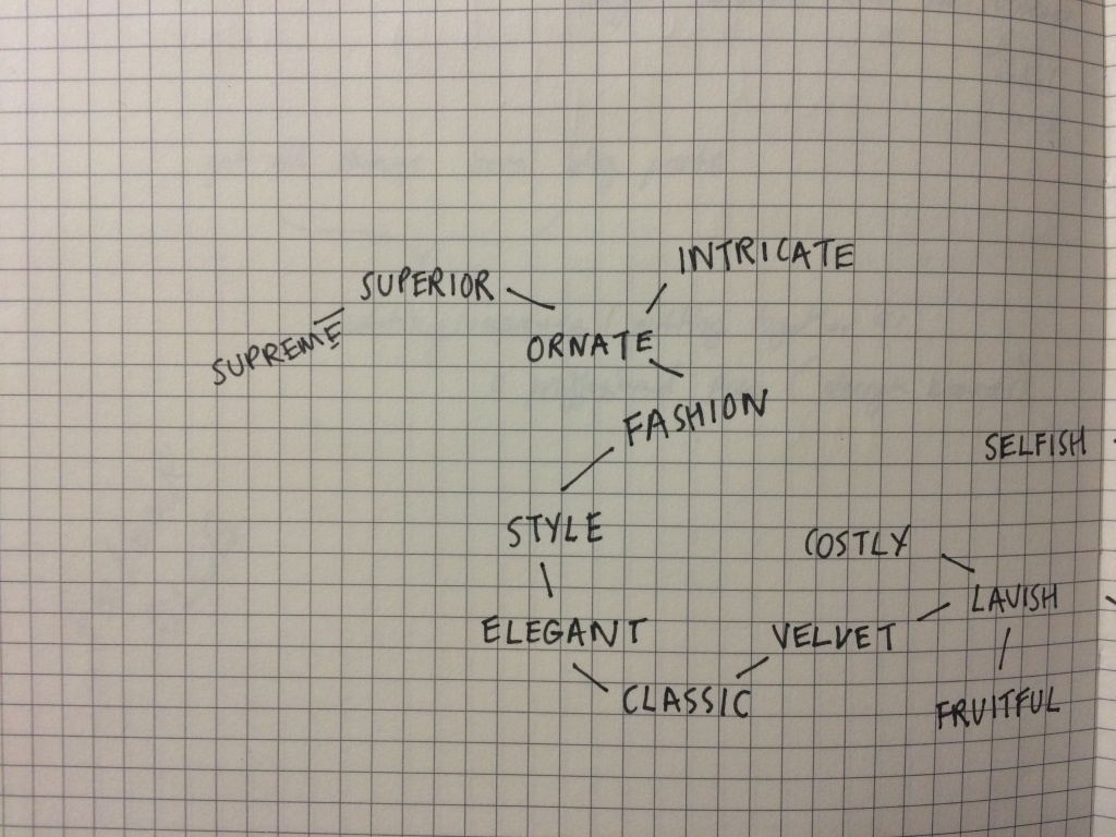
Rich
adjective
- having a lot of money or valuable possessions.
- containing a lot of something good or useful.
- containing a lot of exciting events or experiences and therefore very interesting.
- having wealth or great possessions; abundantly supplied with resources, means, or funds; wealthy.
- of great value or worth; valuable.

Müeller-Brockmanns lead typefaces.
Garamond, Caslon, Baskerville, Bodoni, Clarendon, Berthold, Times, Helvetica, Univers
regular italic bold

Garamond
- elegant, general, legible/readable
- old style of serif typefaces
- designed by Claude Garamond, a French publisher and type designer.
- many modern interpretations are based on designs by Jean Jannon, a French printer who was inspired by the work of Garamond himself
- designed by Tony Stan in 1975 for the International Typeface Corporation.
- Adobe version created in 1989 by Robert Slimbach

by David Kadavy
When researching the typeface, I came across an interesting article arguing Garamond is not suitable for the web.

Kadavy argues that due to the pixelation that can occur whilst designing on the web, the curved serifs become distorted due to the unclear shapes and lack of straight lines.
This point of view is something to consider when choosing a typeface to adapt and evolve into my own design. Especially if the typeface was used for an online version - which is very common and expected in today's digital age.
Caslon
- serif typeface
- instantly reminded me of Garamond, due to their similarities
- very readable/legible
- good for body of texts
- used in lots of magazine covers/spreads
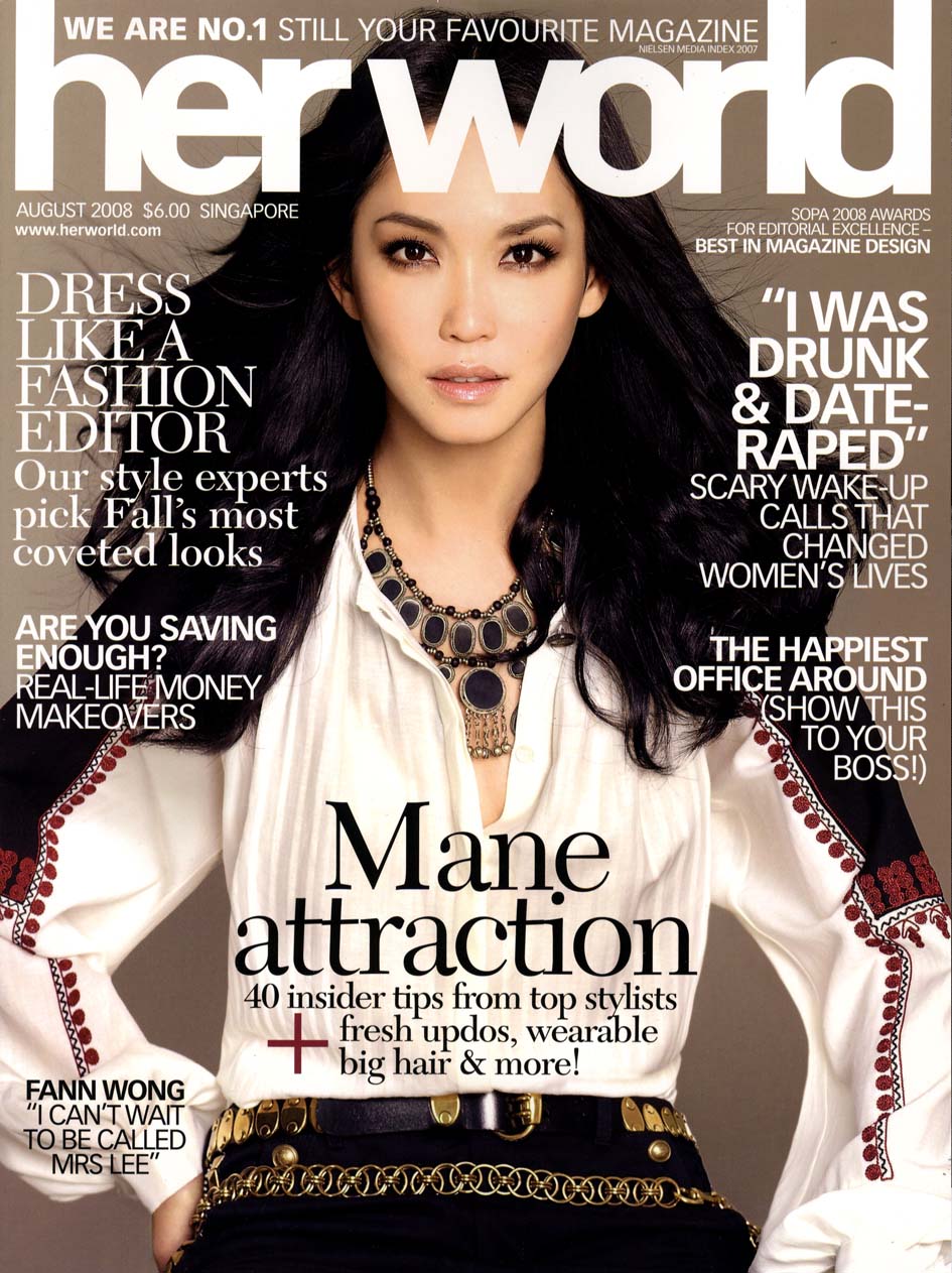
Due to Caslon being so readable and the fact it's used in a form of media that is so widespread and read globally, it suggests it would be good starting point for my typeface design. For example, if I was to use my final typeface for a large company in a global campaign, it would already feel comfortable for audiences and possibly recognisable. Which gives a sense of familiarity and trust in a companies product or promotional campaign.
Baskerville
- serif typeface
- elegant bookface
- well known for it's use in large body of texts
- Cheryl Yau


"Having been an early admirer of the beauty of letters, I became insensibly desirous of contributing to the perfection of them. I formed to myself ideas of greater accuracy than had yet appeared, and had endeavoured to produce a set of types according to what I conceived to be their true proportion."
Bodoni
- serif typeface
- Bodoni is also used in fashion magazine spreads, magazine covers and posters, due to its pleasant aesthetics when set in bigger sizes
- older versions used in book prints
"...this typeface is generally not suited for setting big bodies of text, as the verticality of the letter forms interferes with the text’s horizontal rhythm (we read left to right, but Bodoni leads our eyes up and down instead)."
- ifoundmedinosaurs.wordpress.com
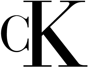
Calvin Klien use Bodoni in their logo
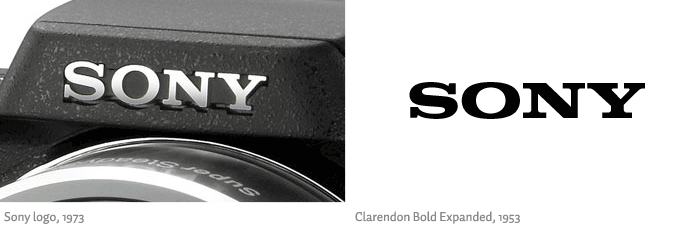
Clarendon
- slab-serif typeface
- The typeface was released by Monotype in 1935, and reworked into its modern form in 1953 by Hermann Eidenbenz
- used in many headers for published books, magazines and
When first thinking of the word Rich and how it's represented through type, I instantly thought about logo's for high end brands and how they


Berthold
First began experimenting with variety of the Müeller-Brockmann typefaces to get a feel for which ones would be more appropriate for my chosen word. Adobe Illustrator I doubled up the width of the original ...... and filled in the spaces in between to create a full letter form. Gives it a thicker, prominent and distinct appearance.

bodoni
although they liked the more classic font, (boding) they much preferred the thicker font experiment I created of berthed - link to works in mind map - and what it represents - not the typical 'rich' 'royal' 'elegant' style you'd expect. - it all depends on the context it is used in. e.g. geology magazine vs. international company logo/promo campaign
sketches of designs that i could collaborate with in types.


No comments:
Post a Comment