Monday, 30 November 2015

Study Task 02 - Symbols

Chosen Olympic Event - Taekwondo 


Beijing Paralympics, 2008


Colour is important when considering the context of the design. It is something that has to be thoughtful and represents the country, region or event it would be for.

Using two or three colours to incorporate into pictograms is simple, yet effective. It is not over complicated and is very representative.

Instead of representing a country or city the games are held in, I could look into colours that are involved with Taekwondo.


The belts achieved at each stage in Taekwondo are a good indication and an obvious representative.

However, from rereading the study task brief, the pictogram has to be monotone. Which restricts my decision to design using colour. Instead, I could focus on the cultural aspects of the design and perhaps include colour towards the end in the final design, just to see how it would look as an example for one of the Olympic games (past or future).

Final Designs


Study Task 01 - Wayfinding - Initial Research

University of Leeds


Around the university campus, there are various types of signage, maps and navigation systems. The first I spotted was the main map that displays the site. This was probably due to its scale and positioning (located on a main pathway). The other signs to me only became obvious when searching for them. It seems that size and scale does grab attention, which I believe is necessary as it is probably the most important and used by people. 
  • curved
  • 3D
  • good contrast of colours (green and white) for text - readible/legible
  • map uses a key - obvious choice and calculated design decision due to the large amount of information is provided 
  • positioned below head height - approachable


Following the same colour scheme and use of type, the university has dimensional signage to instruct important locations. The design is very simple, yet effective. By keeping the same type and size the sign is seamless and uncomplicated. 

However, a better solution to this particular sign could be to alter the type sizes in order of significance. 'Entrance' could be made slightly smaller to represent that, as the 'Earth and Environment' building is more general than a specific area of it.


The university logo does not take anything away from the design of the sign due to its simplicity and  monotone form. 


Leeds Beckett University


In contrast, I decided to document and explore Leeds Beckett's designs. I found the map that navigates part of the Beckett buildings to be much more simpler than the one found in the University of Leeds. It uses a similar muted colour scheme, although, it uses more playful expressive colours to represent the university.


  • simple map layout
  • small key
  • pictograms 
  • uses different type for the letters of the key vs. when they're on the map - possibly to not confuse reader with circular pictograms 
  • map outlines important sections - still involves surrounding area


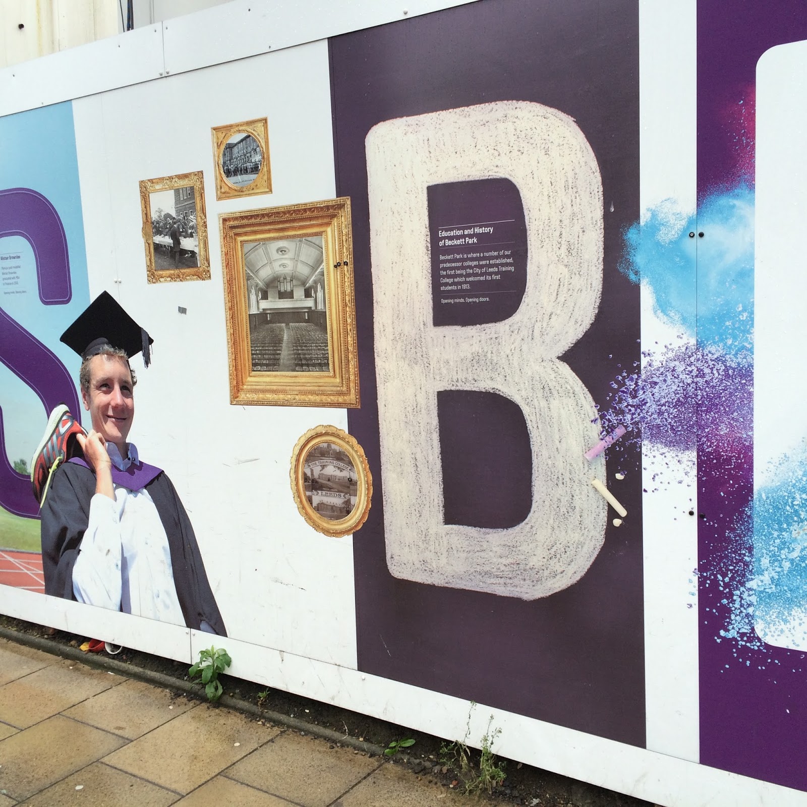
Although, not necessarily a sign, this expressive display gives information in a temporary location.
  • expressive - whilst still giving information
  • wall art?
  • keeps within colour scheme
  • each section explores a part of the university
  • acts as a mini perspective 

  • although in the distance from the university building, it sits underneath 
  • acts as a guide?
  • multipurpose 


Part of the design uses small text to create large letters. It offers information on the university courses, whilst still making it interesting. 
However, one issue is that the D shape that creates the negative space cuts through and blocks some of the text off, making it not entirely legible. This means the designer has not taken into account that the information will actually be read, but relied their design on the basic of aesthetic and the appearance it creates.

This is something I will deeply consider and be careful with when creating my own signage. I do not want to entirely rely on aesthetic preference, the information the sign is offering is the most important factor and should be easily understandable for the audience/reader.


Leeds Trinity Shopping Centre


Leeds Trinity shopping centre uses a combination of pictograms, arrows and colour coded maps.


  • detailed 
  • information split using building structures (from birds eye view) with key
  • quite long/complicated 
  • small print - quite confusing?
  • colour co-ordinated floors make them distinguishable as each floor layouts are very similar


  • yellow signs
  • lit by white lighting 
  • uses consistent font
  • symbols to represent areas
  • uses block of colours next to 'Lower Ground Floor' and 'First Floor' to represent colours used on main map
  • arrows used - black arrow on white background - circle symbol 


One issue I would take up is with the colour choice.

Although, the yellow used is not as bright or vibrant as the example I have shown. It seems the colour yellow has been taken into consideration when creating the sign. The pale mustard colour used does make the sign more readable - the lighting also used around the sign helps illuminate the text, symbols and arrows within the sign.

The lighting behind the signs actually create shadows from the individual four signs (two arrows, two text based). It forms a constant outline to the sign, which amplifies and draws more attention towards itself.

Friday, 20 November 2015

Design Principles - How Do You Read? Development - Yellow

Yellow concept - Analyse the colour yellow. Producing facts, colour variations, colour theory and colour principles etc...


Thursday, 19 November 2015

Study Task 02


Purple 

This colour makes me really cringe. Everything about it just does no justification for me.
I avoid using it in my work and I own nothing with the colour.

Purple denotes wealth, quality, fantasy and creativity.


Yellow 

Yellow is my favourite colour. It is vibrant, it is present in nature, it is the most positive colour.
Showcases intellect, optisism and cheerfulness.


Saturday, 14 November 2015

Studio Brief 2 - Typeface Design


Rich
adjective 

- having a lot of money or valuable possessions.
- containing a lot of something good or useful.
- containing a lot of exciting events or experiences and therefore very interesting.
- having wealth or great possessions; abundantly supplied with resources, means, or funds;   wealthy.
- of great value or worth; valuable.


Müeller-Brockmanns lead typefaces.

Garamond, Caslon, Baskerville, Bodoni, Clarendon, Berthold, Times, Helvetica, Univers


regular italic bold


Garamond 

  • elegant, general, legible/readable
  • old style of serif typefaces
  • designed by Claude Garamond, a French publisher and type designer.
  • many modern interpretations are based on designs by Jean Jannon, a French printer who was inspired by the work of Garamond himself
  • designed by Tony Stan in 1975 for the International Typeface Corporation.
  • Adobe version created in 1989 by Robert Slimbach              


by David Kadavy

When researching the typeface, I came across an interesting article arguing Garamond is not suitable for the web.

Kadavy argues that due to the pixelation that can occur whilst designing on the web, the curved serifs become distorted due to the unclear shapes and lack of straight lines. 

This point of view is something to consider when choosing a typeface to adapt and evolve into my own design. Especially if the typeface was used for an online version - which is  very common and expected in today's digital age. 

Caslon

  • serif typeface
  • instantly reminded me of Garamond, due to their similarities
  • very readable/legible
  • good for body of texts
  • used in lots of magazine covers/spreads


Due to Caslon being so readable and the fact it's used in a form of media that is so widespread and read globally, it suggests it would be good starting point for my typeface design. For example, if I was to use my final typeface for a large company in a global campaign, it would already feel comfortable for audiences and possibly recognisable. Which gives a sense of familiarity and trust in a companies product or promotional campaign.

Baskerville

  • serif typeface
  • elegant bookface
  • well known for it's use in large body of texts

"Today it remains one of the most popular and classic typefaces for print, for its legibility and refined beauty."


 - Cheryl Yau
"Having been an early admirer of the beauty of letters, I became insensibly desirous of contributing to the perfection of them. I formed to myself ideas of greater accuracy than had yet appeared, and had endeavoured to produce a set of types according to what I conceived to be their true proportion."
- John Baskerville, preface to Milton, 1758 (Anatomy of a Typeface)


Bodoni


  • serif typeface
  • Bodoni is also used in fashion magazine spreads, magazine covers and posters, due to its pleasant aesthetics when set in bigger sizes
  • older versions used in book prints

"...this typeface is generally not suited for setting big bodies of text, as the verticality of the letter forms interferes with the text’s horizontal rhythm (we read left to right, but Bodoni leads our eyes up and down instead)."
- ifoundmedinosaurs.wordpress.com


Calvin Klien use Bodoni in their logo

Clarendon
  • slab-serif typeface
  • The typeface was released by Monotype in 1935, and reworked into its modern form in 1953 by Hermann Eidenbenz
  • used in many headers for published books, magazines and 


When first thinking of the word Rich and how it's represented through type, I instantly thought about logo's for high end brands and how they 


Berthold 

First began experimenting with variety of the Müeller-Brockmann typefaces to get a feel for which ones would be more appropriate for my chosen word. Adobe Illustrator I doubled up the width of the original ...... and filled in the spaces in between to create a full letter form. Gives it a thicker, prominent and distinct appearance.


bodoni


although they liked the more classic font, (boding) they much preferred the thicker font experiment I created of berthed - link to works in mind map - and what it represents - not the typical 'rich' 'royal' 'elegant' style you'd expect. - it all depends on the context it is used in. e.g. geology magazine vs. international company logo/promo campaign 

sketches of designs that i could collaborate with in types.