01: (mini brief)
02: Photography branding pack
03: Spectrum
04: A Road Magazine (uni collab/live brief)
05: Secret 7 (competition)
06: Gothic typeface
07: Northern identity
08: (mini brief)
09: (domi music branding?)
10: __________
Friday, 6 October 2017
Thursday, 18 May 2017


Studio Brief 02 - Evaluation
Exploring the issues that we face with social media as a modern society has been an interesting exploration. Through research and
My methods of research have been diverse, from analysis of a TV series episode, TED Talk and to a online essay by Stephen Fry - each have given me a different perspective on the dark sides of social media and what it means to use today as a society.
My design took inspiration from the visuals and metaphors that were presented in my research, mostly coming from the Black Mirror episode where various interesting reflective scenes were evident. They ultimately inspired the final outcome for the poster, which explores the potential fake personas people put out about themselves over social media, contrasting a more real version to try and invoke a reaction of the audience who might think of a time they have lied and possibly done something over social media that isn't necessarily real.
The aim of the project was to create awareness and promote the real life vs the fakeness of social media, that often disillusions an audience into believing that person leads a "perfect" life.
Totes, badges and a #hashtag for social media purposes were created for the sole purpose of a younger audience, which is the age range for the people who are mostly affected by the negative elements of social media.
Wednesday, 17 May 2017
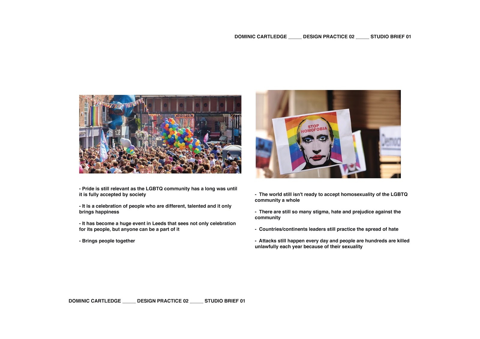
Studio Brief 01 - Evaluation
The screen printing process was something completely new, as I had not experimented with a gradient colour print before. Achieving a successful gradient was not an easy task as the paint had to be constantly topped up, which took time, and could have as a result dried my screen more quickly, causing the last couple of prints to come out more faded than full colour.
The use of the rainbow gay pride flag was important for this design and very relevant as the main feature of the design was a typographic expression of the word "YEAH!"; used to create a positive and uplifting vibe. However the main element of the design was not focused around the word "Pride" or "Leeds"and it did not feature the word "Gay" or "LGBTQ". Furthermore, this was done for a reason as I wanted the colours to represent the gay community instead of the words.
The design I believe has been successful as it boldly expresses the aesthetics of what pride is about - being loud about who you are and celebrating a community that brings people together through positivity.
Friday, 12 May 2017

Saturday, 6 May 2017


Wednesday, 3 May 2017


Saturday, 29 April 2017


Thursday, 27 April 2017
Studio Brief 01 - Screen print colour research and process

For the colours used within the screen print I have decided to experiment with a gradient, which is something I haven't explored before.
I have researched into how the process works, from the video tutorials it just rather simple. The paints are literally just placed next to one another and blended with the tool that pushes them into the screen and thus onto the paper.
Reasons for screen print method:
- Will be able to achieve precise design (from a digital)
- Would not have been able to develop any typography as the same font was not available
- Would not have been able to develop the gradient with other traditional print methods e.g. monoprint
Reasoning behind the colour choices:
"The rainbow flag, commonly known as the gay pride flag or LGBT pride flag, is a symbol of lesbian, gay, bisexual, and transgender (LGBT) pride and LGBT social movements. (Other uses of rainbow flags include a symbol of peace.) The colours reflect the diversity of the LGBT community, and the flag is often used as a symbol of gay pride during LGBT rights marches. While it originated in Northern California, the flag is now used worldwide."
- Strong connection to gay pride
- Through a survey conducted by myself was found to be meaningful


Some of the colours has to be mixed to achieve a more precise correct colour of the flag. I wanted to get as close as I could to the original flag colours to create a strong connection.

I often mixed three or more colours to achieve one I was happy with.

I also had to tone down some of the colours as they mixed darker than they appear from the bottle. Achieved this by adding white bit by bit to create a lighter shade.

- One thing I have learnt from past experiences with screen printing is to stick down the paper before printing begins
- I stuck each piece down with tape onto the base so they wouldn't move or smudge and then after each one was printed removed it swiftly so I could quickly print the next


Tuesday, 25 April 2017
Studio Brief 02 - Campaign distribution
Social Media
 Creating a hashtag is a great way to access the social media platforms as a form of advertising and awareness. As people use the hashtag it creates a connection between the people that use it as it can be accessed by anyone and easily distributed. It is also free meaning no expenses effect the campaign.
Physical products


Physical products


These products target the younger audience of 16 - 24.
Sunday, 23 April 2017
Studio Brief 01 - Mini crit and further poster development
These are the two choices for the final outcome. As part of a group crit with student peers in college I asked them which suited the style of "Pride" and which one would be better suited for the gradient screen print.
 |
| Using Bebas Neue font |
The type on this design has been specifically chosen to co-exist with the type for the "YEAH!". Both are quite tall, although Bebas has a smaller weight to it.
 |
| Using Bebas Neue and MV Sans font |
Feedback:
- Second one is more bold, expressive and "proud"
- Second stands out much more which will especially be needed if you are print will be gradient
- First design using Bebas Neue is much more easier on the eye and if the colours are going to be vibrant it might be an interesting idea to keep the first design as the kerning on the type makes it defined and bold in its own way
Final poster design

Here is a digital mock up of how the gradient will appear like once screen printed.
Thursday, 20 April 2017
Collaborative Practice - Group communication


Facebook
We communicated mostly through Facebook messenger, organising meet ups, having general conversation about where we was up to with our own individual work and even critiquing work as we went along.
Meetings
Meetings were definitely the most beneficial as we got to go back and forth more smoothly with ideas. We mostly met at uni, although Meg came round to mine and Alice's house a few times as well as she lived close. In a way working with a friend was very much beneficial as we could talk about the project as we pleased, which meant a stronger communication and better grasp on the project.
Google Drive
We also communicated through Google Drive as we could easily share each other's work and edit certain aspects if we needed to.
Friday, 14 April 2017
Studio Brief 01 - Further poster/type development

- Compared to the initial designs for the main body of text for the poster


combo of type


Subscribe to:
Comments (Atom)