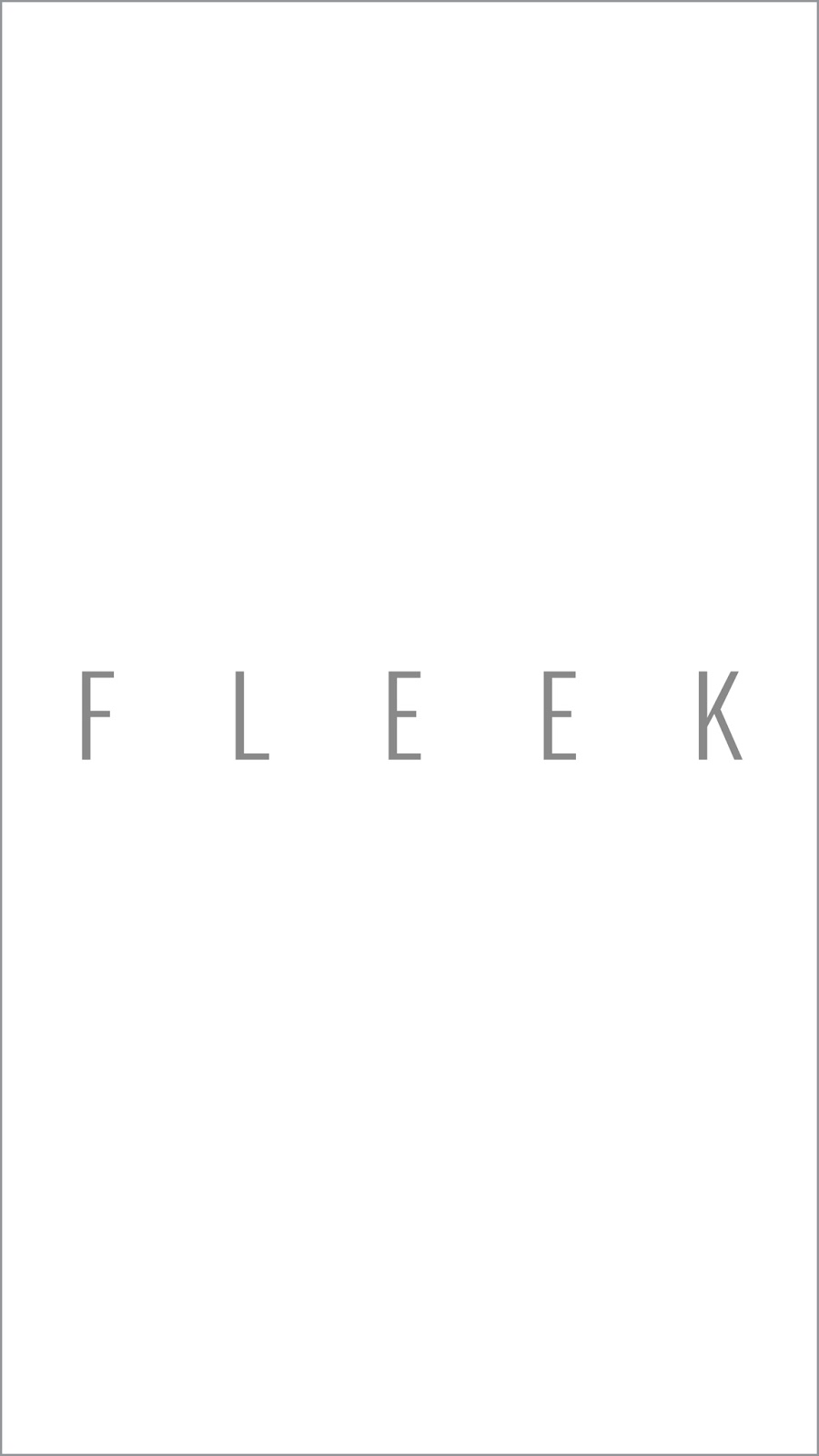
Title/Logo: This is the loading page once the app has been accessed. The logo is positioned central to focus the viewer and set the tone of how the app will appear throughout. The large scale of the logo was decided to be impactful and rememberable, hopefully leaving a lasting impression.
The Logo will be a feature throughout the app, making a visual statement on the majority of the pages to help keep the aesthetic alive and to constantly remind the viewer what app they are using.
This is the landing page of the app, where the majority of pages will link back to. I kept the three links central to the page as once the loading page fades out they appear in the same position as the logo, making it flow more and easier on the eyes.
The large box represents the link to the uploading of the photo for the image search. This was created large purposely so the viewer can basically click anywhere within the square shape. A pictogram of a camera will also be positioned within the box to represent the image upload process without having to put in extra text. This was a common theme seen throughout the apps that have been researched, a symbol/pictrogram can communicate much more than a word can in some cases.
At the bottom right there will be an arrow to take the user back to landing page. This feature will continue throughout the app.
This represents the link between photos being accessed on an iPhone/Android. The design represents a list of the current images that are in the viewers "Camera Roll" so the correct image can be selected to enable the image search for the price comparison.
Similar to prior design, with included link to upload the selected image. Also features the option to exit back the landing page.
This showcases the original product, pricing, name, brand name and selected photo. Following this are the cheaper alternate options showing an image
The text boxes for the original product have been made larger to showcase the dramatic price difference and to make appear separately from the new options.
Barcode section so a product can be scanned in person, accessing the viewers camera to do so. Also features an alternative option to type in the barcode if the first option fails.
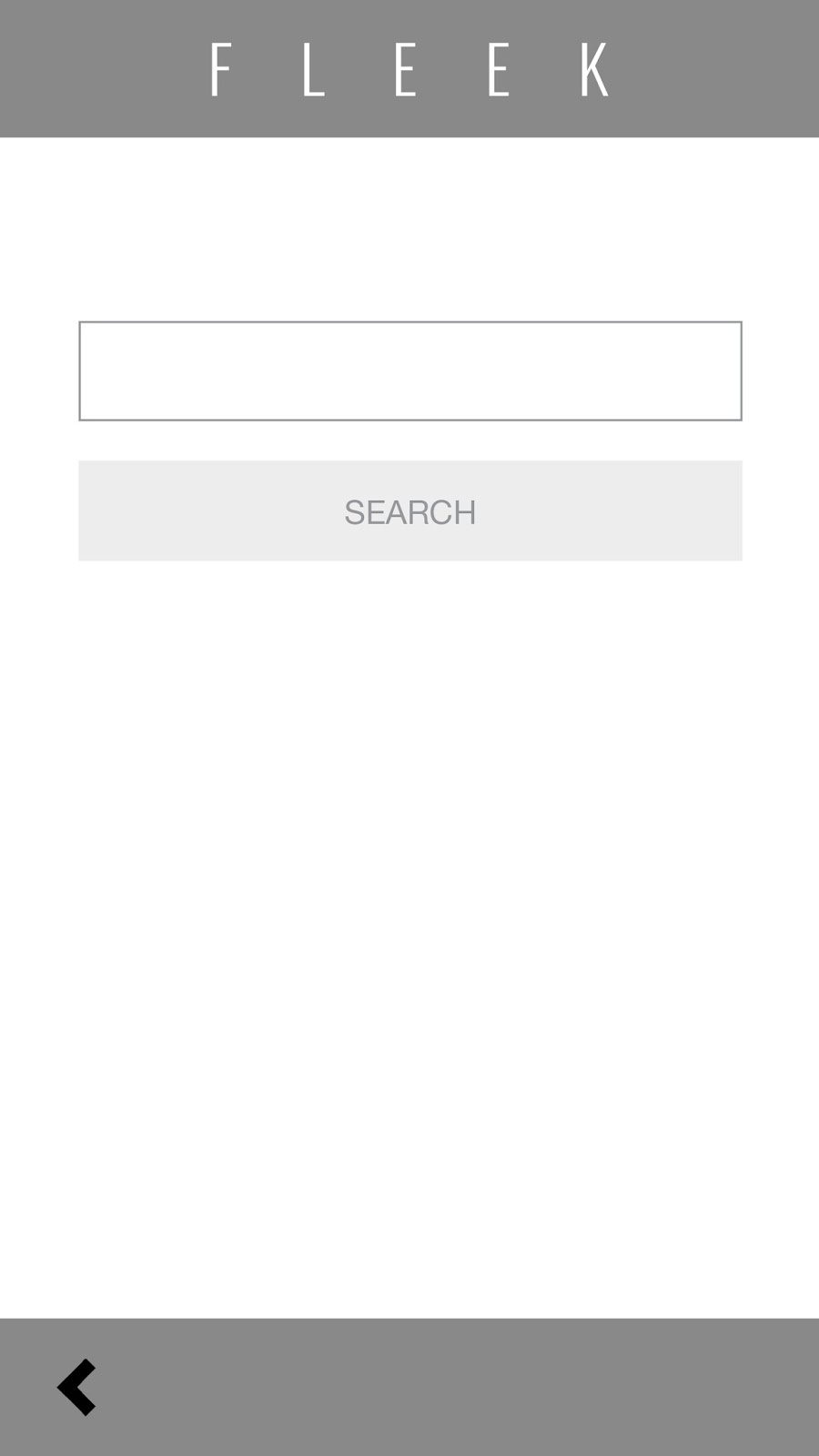
URL entry box with "search" button.
- The layout was designed to be simple, easy to use and clear with its direction
- Negative space has been included heavily to appear less intimidating and more relaxed
- Large buttons have been used to make for an easy click
- Sharp shapes have been used to express a sleek, professional style
- The backspace follows on from the safari aspect of the app
- Large images will be used to attract the audiences attention
- Type used will be minimal, as younger audiences prefer more image heavy designs
The above image shows how the wireframes work with each other.