
After adapting and changing my initial idea, I firstly kept with the same design.
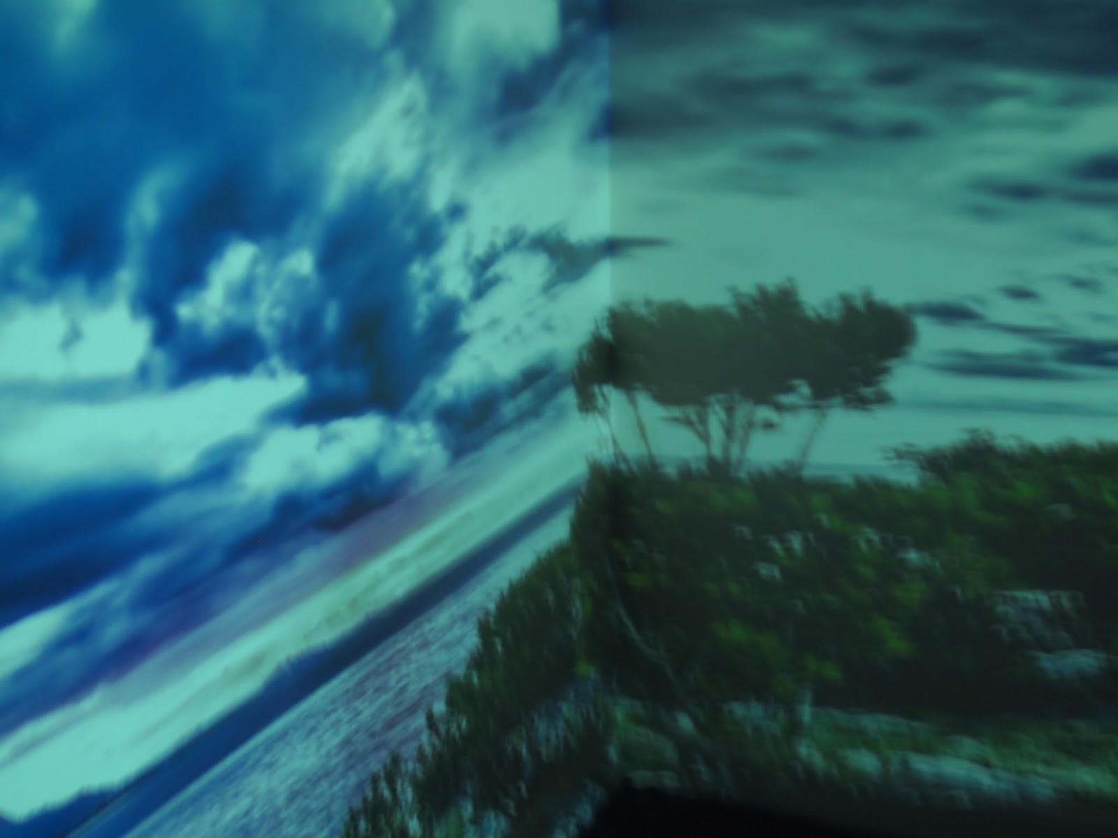
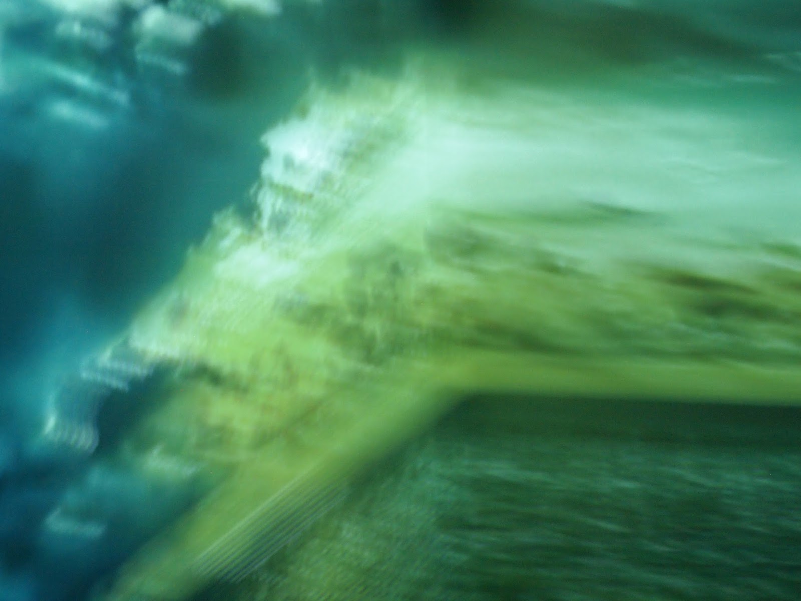
I then thought I could make it appear more interesting by using some of my photography shots from a recent shoot. Where I projected dreamy, earthy, weather scenes from youtube videos and photographed them to demonstrate a photographic representative that could be used for a front cover.


Edited out the cursor I accidentally left on.
Placed in the simple title and centred it.

To create a different vibe I replaced the O's with moon like symbols and A's with a triangle shape. These code like symbols give off a certain mystery and represent the idea of de-coding our dreams.

Original. Typeface - Adobe Devangari Bold.

No comments:
Post a Comment